Remittance Transfers
Remitly's new optimized native app for international money transfers. Send money home to your loved ones.
Launched on
Visit →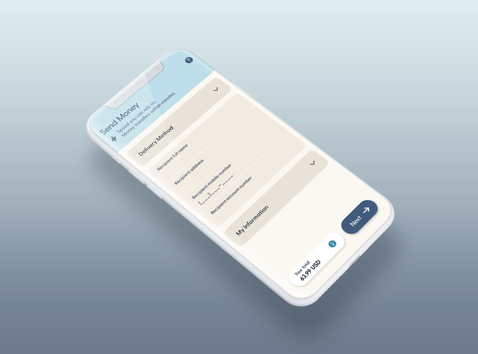
Overview
Remitly’s vision is to transform the lives of immigrants and their families by providing the most trusted financial services on the planet. Their initial laser focus is on the global remittance industry — making it faster, simpler, and more reliable to send money home.
As Senior Product Designer, I led UX design across the core conversion funnel on Remitly’s iOS and Android app. Retention research had surfaced a significant problem: 32% early churn and 18% one-and-done send rates among new customers. Both Remitly’s customer service team and CI research pointed to funnel length and user errors during the transfer process as primary drivers.
Define
A review of 138 Name Change Amendment phone contacts revealed that confusion or mistakes entering the Recipient Name Field alone accounted for 56% of cases — a single field causing hundreds of avoidable contacts per week.
Business impact: Fixing the Recipient Name Field alone would reduce an estimated 300–400 contacts per week — a projected $60,000–$80,000 reduction in annual OPEX.
Industry research reinforced the urgency. One of the top reasons for checkout abandonment is a process that feels too long or too complicated.
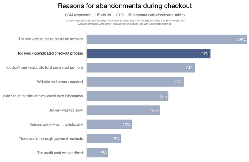
Our hypothesis: decreasing checkout time and reducing user error would increase preference and completion speed. We set out to test progressive disclosure, form design best practices, new layouts, conversational text, and platform-specific controls — focusing on Payment Details and Recipient Information, the two steps with the most customer service–reported problems.
Sketch
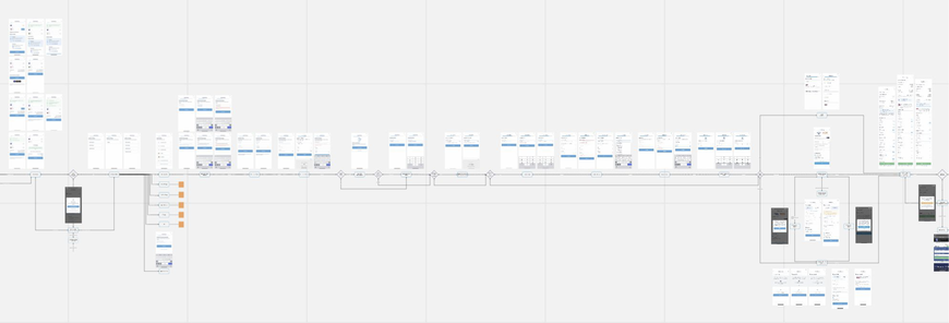
The existing transfer journey was mapped end-to-end to identify every point of friction before exploring new directions.
Research on accordion forms suggested they tend to be more preferred than long multi-step flows — with some studies reporting more than doubled user preference and as much as a 144% speed increase. Three concepts were designed and tested against each other.
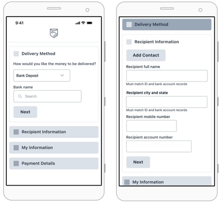
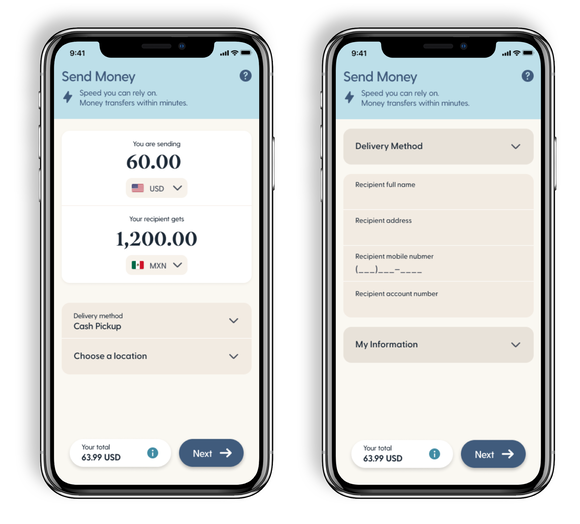
Design A — Accordion
A single-screen approach where steps expand progressively. Users could see the full journey at a glance without navigating between screens.
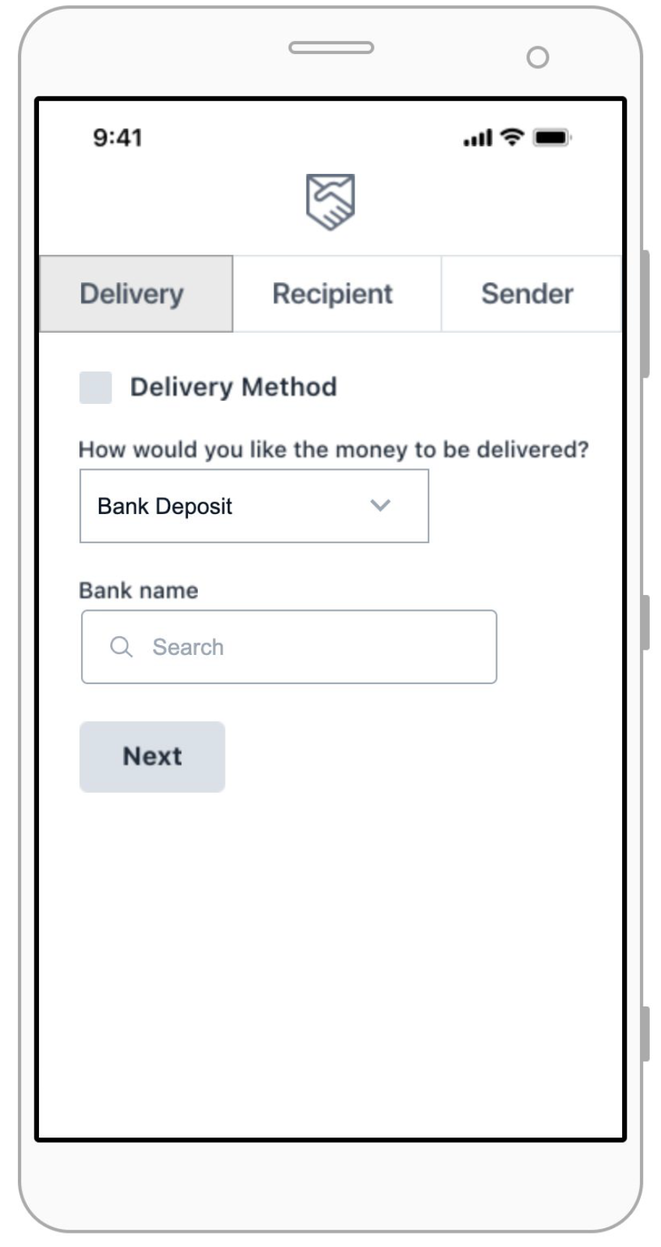
Design C — Tab-Based Stepper
A tabbed navigation model separating Delivery, Recipient, and Sender information into distinct sections — giving users a clear sense of position within the flow.
Prototype Testing
Three designs were tested with participants across both moderated and unmoderated sessions.
Design A — Accordion: 4/6 users preferred this design. Users enjoyed seeing all steps on one screen. Field grouping needs precision — input types and formatting require further testing. One user specifically called out preferring the bank search interaction.
Design B — Scheduled Send: 3/5 users preferred this design. A single page that splits into individual screens for data collection. Users felt the experience was fluid and quick — they appreciated everything on one page and didn’t want to keep hitting “Continue.”
Design C — Stepper: 3/6 users preferred this design. Users completed the form more accurately than in the current experience. Concepts substantially different from the current experience performed with higher preference — a useful signal for future live testing.
Most users struggled with date formatting across all designs — HTML prototypes were recommended for future input-focused testing.
Final Design
The accordion pattern was selected based on preference scores and the meaningful speed improvements observed during testing. The final visual design was a joint effort built on top of the marketing team’s new brand update.
Scheduled send — a key outcome of this work — launched to 6,000 customers and scaled to 54,000, validating both the design direction and the business case for funnel simplification.