HR Screening Dashboard
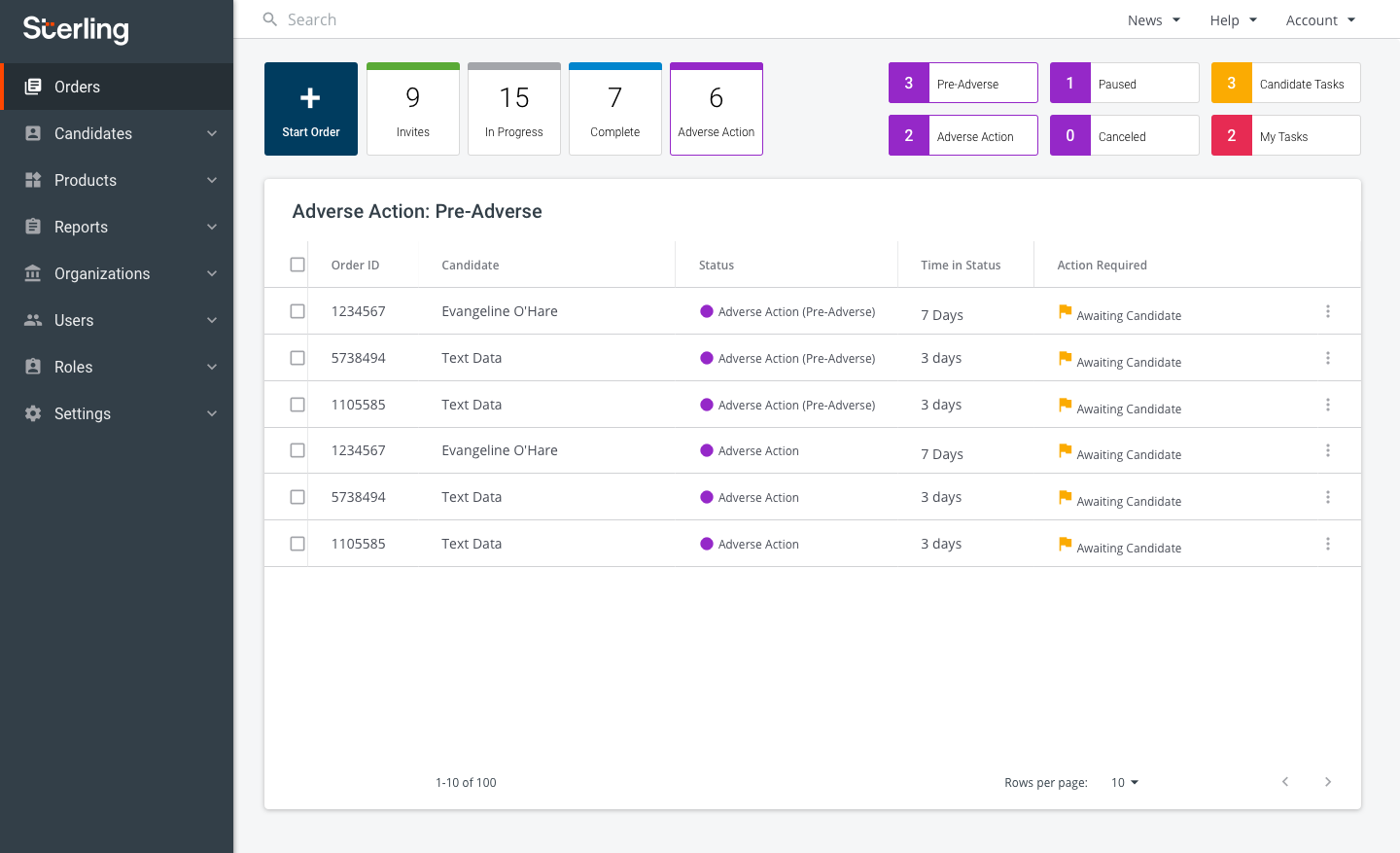
Sterling's brand new client experience. Candidate background screen tracking with ease.
Launched on
Visit →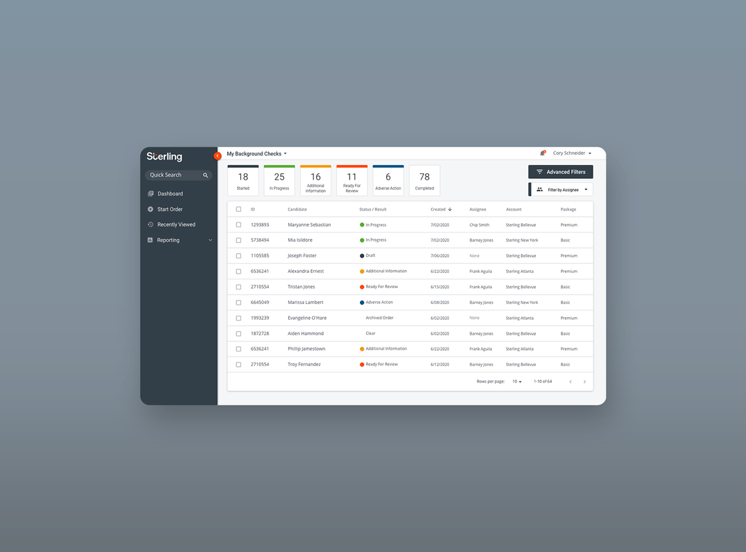
Overview
Sterling is a global leader in background screening and identity services. I led UX design on Project Scorpion — Sterling’s end-to-end platform redesign — a high-stakes initiative that would change how thousands of HR professionals manage background screening every day.
Discovery began before any design work: I conducted job-shadowing sessions and stakeholder interviews across 15+ enterprise clients including Salesforce, Nike, Adidas, Manpower, McKinsey, Bridgewater, and Marsh & McLennan, as well as Canadian and UK banking institutions. More than 200 data points were collected to define redesign strategy and feature priorities.
Before State
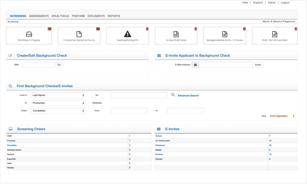
The existing platform, WorkforceDirect, was a dense, form-heavy interface with no clear visual hierarchy, no order-level status tracking, and no way to understand what needed attention at a glance.
Opportunity Identification
Pain points fell into three major categories: placing orders, checking status, and reviewing reports.
- Users don’t know what they need to do next to move candidates through the system
- The dashboard is noisy and doesn’t surface the most relevant information
- No order-level tracking — users can’t tell where a problem is or take action on it
- Difficulty tracking down missing candidate information
- No ability to sort, flag, or reassign orders to individuals or work groups
Competitive Analysis
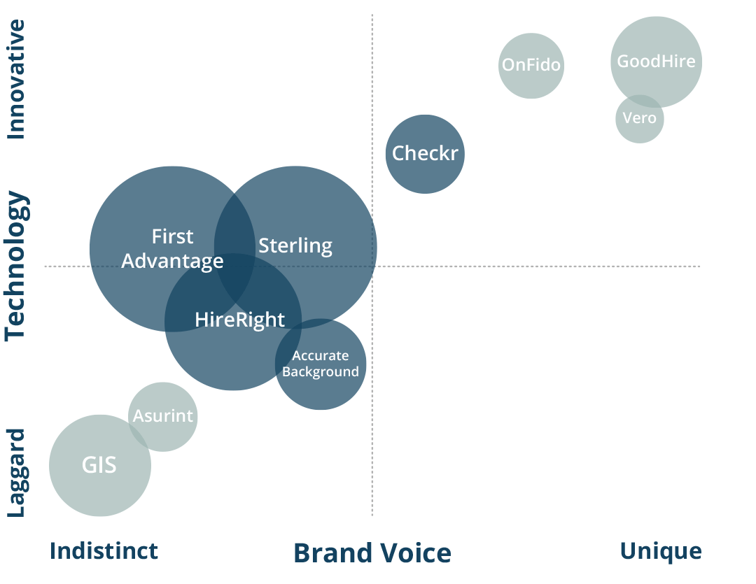
Before sketching, I benchmarked Sterling against key competitors across two dimensions: technology capability and brand voice distinctiveness. This positioned the redesign to close competitive gaps while establishing a more differentiated identity.
Sketch Phase
I led the team through several months of exploration — investigating task management UI, notifications, table displays, filtering controls, progress indicators, and dashboard patterns before converging on a direction.

Prototype Testing — Round 1
Three wireframe prototypes were tested simultaneously with 15 participants to compare approaches across ease of use, discoverability, and task completion.
Testing objectives covered first impressions, defining order status, initiating orders, finding orders requiring attention, filtering in-progress orders, viewing order summaries, and reviewing completed reports.
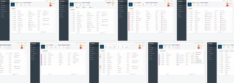
Key finding: color coding of order status was the most consistently noticed and valued feature across all three designs — a clear signal for the direction of Round 2.
Prototype Testing — Round 2
Round 2 focused on two specific decisions: color patterns for order status and the behavior of filtering controls. 10 participants were recruited from HR professionals.
Status color pattern:
- Multi-colored status tiles: 4.8/5 ease, 4.45/5 helpfulness
- Single-color tiles: 4.2/5 ease, 2.3/5 helpfulness
Multi-colored tiles were clearly preferred for identifying and differentiating order states.
Filtering behavior:
- 9/10 participants expected mutually-exclusive filtering — selecting a status shows only that status
- 6/10 participants preferred sub-status filters at the top of the page
- 0/10 participants preferred a hidden filter icon approach
Final Design
After multiple rounds of moderated and unmoderated testing, we arrived at a validated design. Additional features including Advanced Filters and Filter by Assignee were incorporated to meet specific enterprise workflow needs.
The Adverse Action workflow — one of the most legally sensitive parts of the screening process — received dedicated filtering and sub-status management to ensure HR teams could act on flagged candidates quickly and confidently.