FR Compensation Dashboard
Giving financial advisors a single source of truth for their compensation.
Launched on
Visit →
Overview
Northwestern Mutual’s financial representatives earn compensation through a complex web of commission types — First Year Commissions, persistency fees, bonuses, and wealth management payouts — spread across a fragmented set of internal tools. Advisors had no unified view of what they’d earned, what was coming next, or how their practice was trending over time.
As Lead Product Designer on the Total Rewards product area, I partnered with a UX researcher and a supporting designer to design the FR Compensation Dashboard — a centralized experience that consolidates personal compensation data into a single, actionable destination inside the existing advisor platform.
The Problem
Advisors were cobbling together an understanding of their own compensation from four or more disconnected systems: NM Connect Mobile, FMI, CRM Insights, compensation statements, and their own Excel spreadsheets. Many found the compensation program itself confusing — they didn’t understand the algorithm behind their payouts, and they had no reliable way to track progress toward bonuses or identify business trends over time.
The opportunity was clear: consolidate this fragmented experience into one place that gives advisors enough detail to take action, without overwhelming them.
Research
We ran a two-phase research engagement with 6 financial advisors each phase — spanning advisors with under 5 years of tenure and those with 5+ years — using 1:1 moderated interviews, concept testing, and task-based usability testing in Figma prototypes. Sessions were facilitated via UserZoom, with findings synthesized in Mural.
Phase 1 focused on understanding mental models: how advisors currently track compensation, what information they value most, and which details belong at the top level vs. deeper in the hierarchy.
Key findings:
Advisors equate compensation with the revenue and expense health of their practice — not just take-home pay. They use historical data to identify growth opportunities and plan future activity. The progressive breakdown of data (total → Risk/Wealth → revenue streams) resonated strongly. Advisors wanted enough detail to act, without needing to dig. No advisor wanted to share their personal compensation data with staff — business revenue was considered private.
Phase 2 introduced a revised prototype with a new Transactions screen, updated year-over-year charting, and a goal-tracking module. We also ran a System Usability Scale (SUS) assessment to establish a usability benchmark.
Key findings:
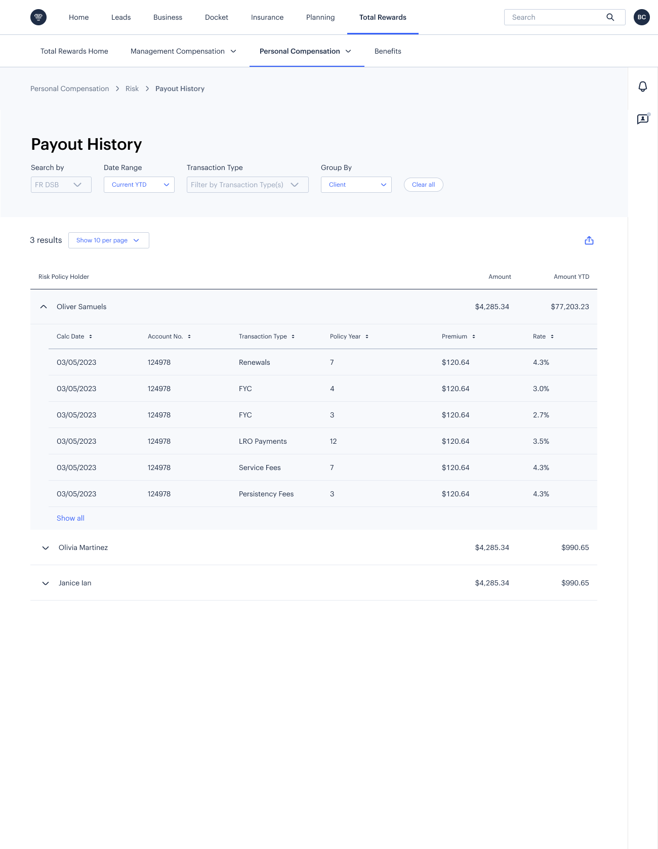
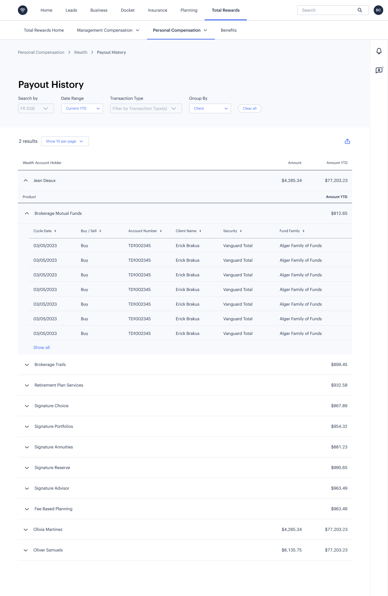
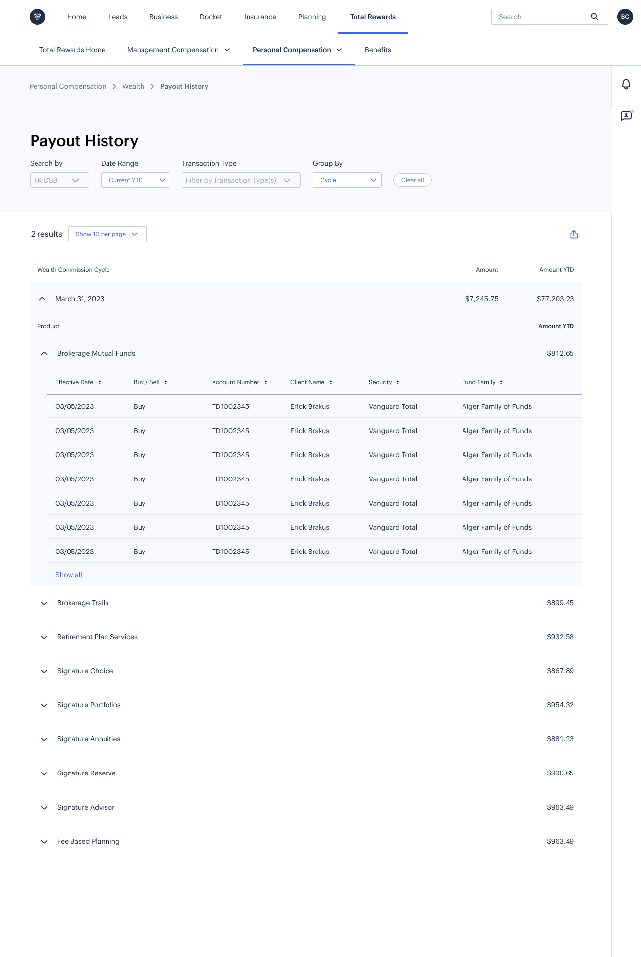
The Transactions screen was highly valued — advisors could finally see which policies were paid out and why a reversal may have occurred, something previously impossible without calling the Home Office. Advisors wanted to track goals relevant to their business and hide ones that didn’t apply. Goal proximity to thresholds was especially motivating. Nearly all participants struggled to navigate from the revenue overview into the Risk vs. Wealth detail subpages — the change in context wasn’t immediately clear. SUS score: 71.7 — rated “Acceptable” and in the 64th percentile for web-based tools, establishing our baseline for future iterations.
FR Compensation Dashboard
71.7
Acceptable · 64th percentileSystem Usability Scale (0–100)
Design
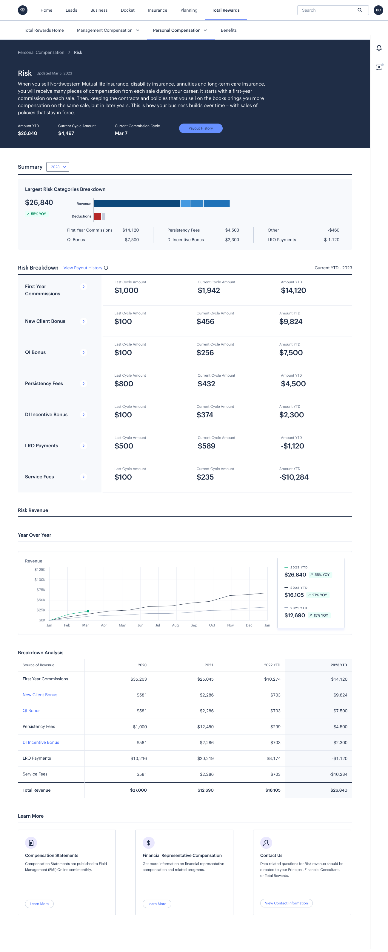
The final dashboard is organized around three core jobs advisors need to do: know what’s coming (upcoming payouts), understand what happened (income summary, payout history), and track where they’re headed (year-over-year trends, goal progress).
Upcoming Revenue surfaces the next Risk and Wealth payout dates and amounts immediately on landing — the most time-sensitive information first.
Income Summary breaks down net income, revenue by stream, and home office expenses in a progressive hierarchy. Advisors can toggle between YTD, upcoming cycle, last cycle, and prior year — a timeframe that persists across the landing page and detail views.
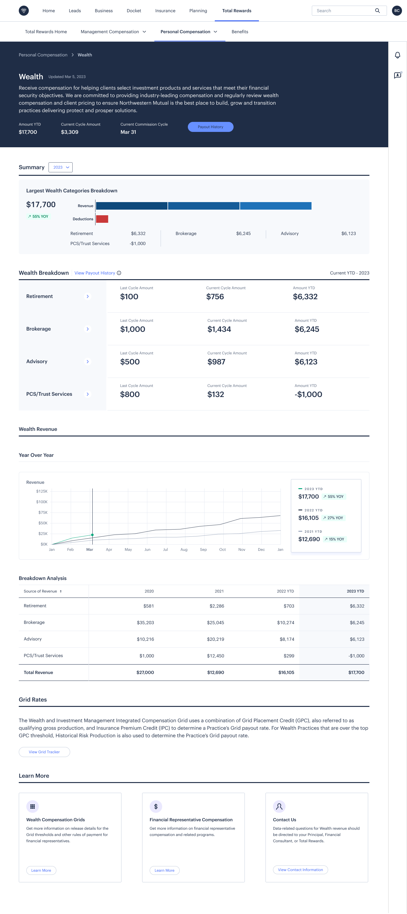
Risk and Wealth Detail pages drill into each compensation type with cycle-over-cycle and year-over-year breakdowns. Bonuses are intentionally kept inside their respective Risk/Wealth breakdowns rather than siloed separately — advisors confirmed these contribute to the same business bottom line.
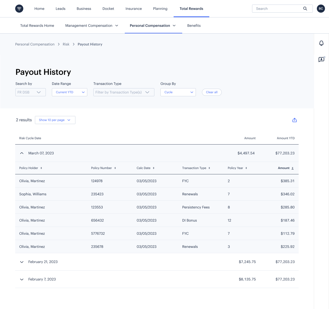
Payout History offers granular transaction-level filtering by client, cycle, and transaction type — letting advisors answer the question “why was this amount different than I expected?” without calling anyone.
Outcome
The FR Compensation Dashboard shipped in late 2023, handing off across multiple engineering teams with HEAP analytics instrumented in partnership with UX Research to measure ongoing engagement. The SUS benchmark of 71.7 established a measurable baseline for future design iterations — a first for this product area.
The Transactions screen, which didn’t exist in Phase 1, became one of the most valued features in testing — a direct result of letting research findings drive scope decisions mid-project.